

Struggling to Make Your Website Work for You?
We bring you the ultimate solution – our comprehensive web audit service
Limited time campaign
What Our Website Audit Covers?
Embark on the Journey to Conversion Excellence with Our Website Audit Report!

UI/UX Audit
User-centric design for unrivaled engagement – discover the art of seamless navigation through our UI/UX audit.

SEO Audit
Rocket your website to the top! Unleash the power of visibility with our comprehensive SEO audit.
UI/UX Audit - Benefits
Enhanced User Experience

Identify and address usability issues to create a seamless and enjoyable experience for visitors.
Increased Engagement

Enhance the visual appeal and interactivity to encourage longer stays on your website.
Mobile Responsiveness

Optimize the website for various devices to provide a consistent experience across desktops, tablets, and mobiles.
SEO Audit - Benefits
Improved Search Engine Visibility

Identify and fix on-page optimization issues to improve search engine rankings.
Technical SEO Optimization

Optimize website speed, security, and mobile-friendliness for better search engine performance.
Content Quality and Relevance

Optimize content for targeted keywords without compromising on user experience.
Website Navigation
We studied pages on the website, grouped them into categories and added
to the top navigation.

The header on the homepage and other pages of the website might seem
confusing to a user because it is not consistent.
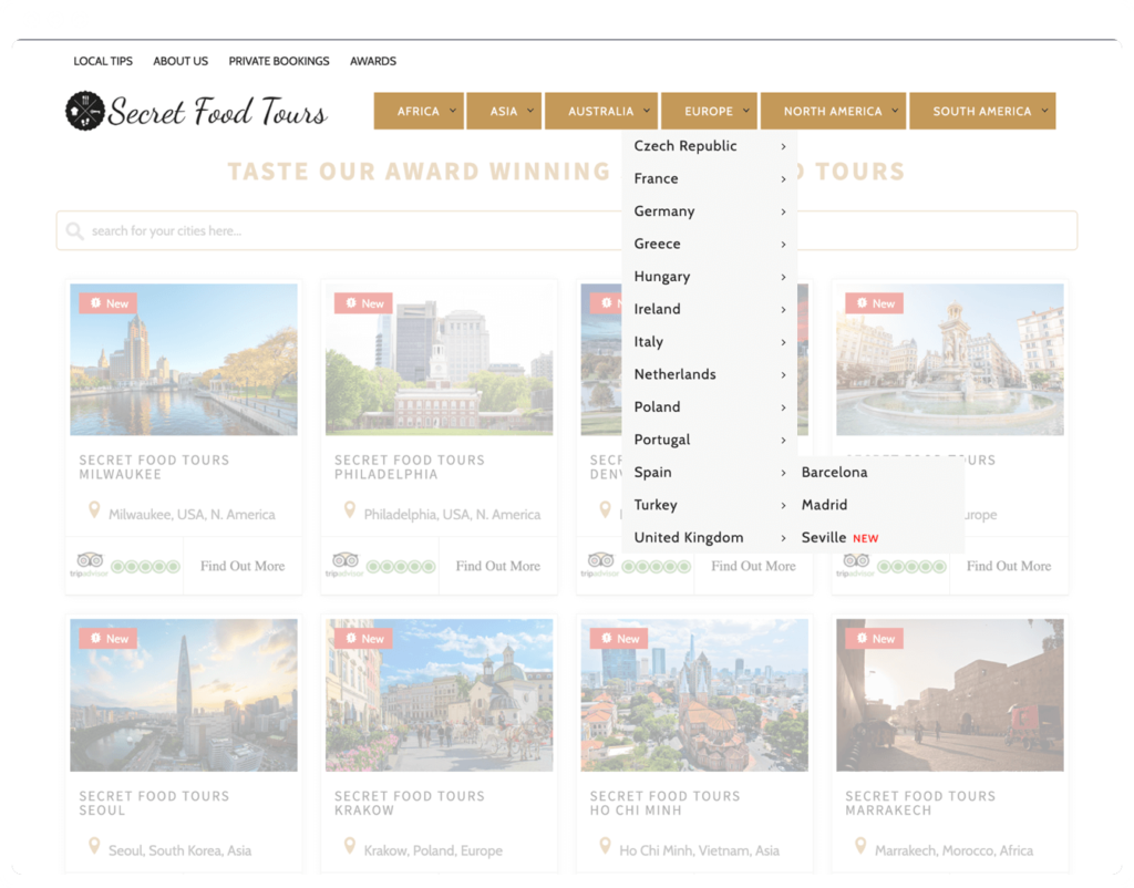
We studied pages on the website, grouped them into categories and added
to the top navigation.

The header on the homepage and other pages of the website might seem
confusing to a user because it is not consistent.

Visual Web Design
We suggest a different approach to the homepage design to solve this
major problem. We’ve added a video to the background of the page, reorganized
tours making a user’s location the basic choice criterion and divided
tours into New and Top.
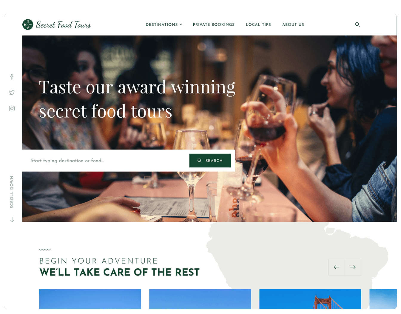
A simple homepage is composed of multiple cards, displaying cities of
the world, search field and the menu. The current design doesn’t distinguish
between the primary and secondary cards. There’s no focus, so the page
doesn’t grab a viewer’s attention.
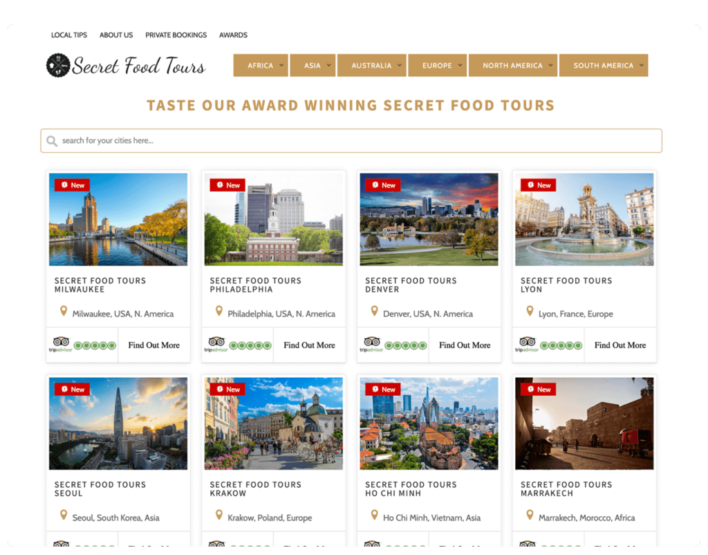
We suggest a different approach to the homepage design to solve this
major problem. We’ve added a video to the background of the page, reorganized
tours making a user’s location the basic choice criterion and divided
tours into New and Top.

A simple homepage is composed of multiple cards, displaying cities of
the world, search field and the menu. The current design doesn’t distinguish
between the primary and secondary cards. There’s no focus, so the page
doesn’t grab a viewer’s attention.

Information Architecture
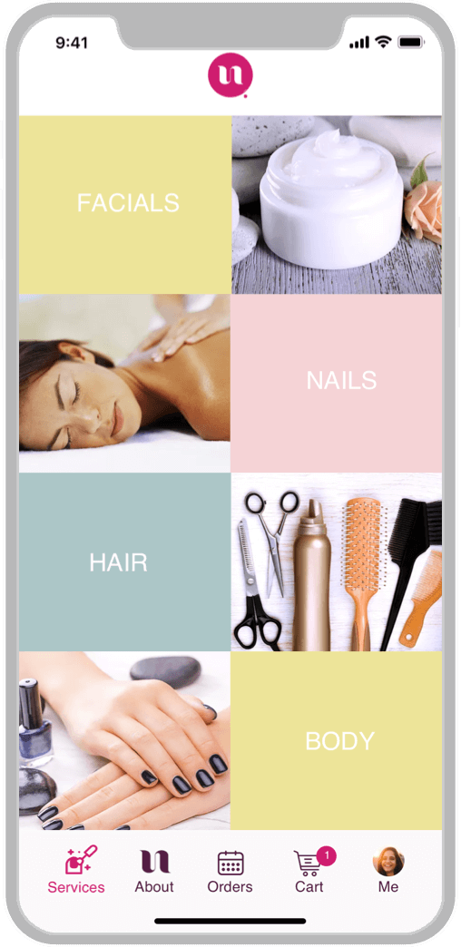
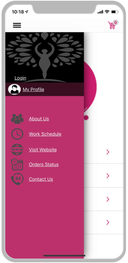
Since we have simplified the navigation and reorganized the menu
structure, there is no need to use the side menu at all. The tab navigation bar
always wins over the hamburger menu. In this case, all items are visible to a
user and accessible on any screen of the app, requiring no extra taps
from a user.
The app navigation doesn’t match the iOS Design Guidelines. When the
menu overlaps the home screen, it looks like the design that you’d typically
se on an Android device, not an iPhone.
Since we have simplified the navigation and reorganized the menu
structure, there is no need to use the side menu at all. The tab navigation bar
always wins over the hamburger menu. In this case, all items are visible to a
user and accessible on any screen of the app, requiring no extra taps
from a user.

The app navigation doesn’t match the iOS Design Guidelines. When the
menu overlaps the home screen, it looks like the design that you’d typically
se on an Android device, not an iPhone.

How it works ?
Embark on the Journey to Conversion Excellence with Our Website Audit Report!

2 minutes
Answer our questions

3 business days
Design audit preparation

Priceless
Get PDF report in your inbox
Our Number Speaks
Websites Audited
0
+
We've audited websites across various industries, delivering tailored solutions for optimal performance.
Customer satisfaction
0
%
Our clients are delighted with the insights and improvements we bring to their websites.
UI/UX Enhancements
0
%
We've successfully enhanced the UI/UX of 90% of the websites audited, creating seamless and engaging user experiences.
Quick Turnaround
0
hrs
Receive comprehensive web audit reports within 72 hours, empowering you to make quick, informed decisions.
Mobile Optimization
0
%
Our audits guarantee a responsive and visually appealing website across all devices.
Ongoing Support
0
/7
Enjoy 24/7 ongoing support post-audit, ensuring your website continues to thrive.
Most trusted and result driven Landing Pages and website designing company in Delhi NCR
Copyright © 2024 Viralbulls. All rights reserved.
